Thursday, August 29, 2019

Ké Apo

Photo's to consider... Front Cover


This unbalanced, angled shot was a trick to the eye - with the horizon off balance with the rock in which i took the photo off. The beach background and surfer aesthetic fits with the travel and fashion theme, with surfing being a great contending holiday. However, the tilt does not fit the criteria for a front cover image, and personally i feel the medium-long shot of the model is too far away for a front cover, especially a first edition. 
This is a closer up, medium close shot of the model, a better contender for a front cover image with the facial features being more identifiable when up-close. The slight smile in the model's face makes for a natural image, along with the wet hair ad surf board making up the components of a relaxed, beach photo. This photo on the other hand doesn't convey any of the criteria's i would want on a front cover of Ké Apo, as the magazine is focusing on body positivity and the natural, realistic image of models. Although this model does look extremely natural, with no costume except the wet suit, it doesn't express any powerful connotations that i feel a first edition would need.


Sunday, August 11, 2019

Ké Apo

Photo's to consider... Contents + Website

 This photo would be considered for contents page or the website, with the Hawaiian shirt contributing to the summer edition of the 1st magazine. The breaking of conventions works nicely with the eyes glancing to the right, with the cheeky smirk on the model's face reinforcing the happy, relaxed atmosphere of Ké Apo. 
This side shot, right center-frame photo of Yellowbelly Pizza ties with the travel/tourism genre of my magazine, with recommendations for food and drink being one of my tasks when getting shots. This is in my local town, however it's aesthetic rather looks more foreign than local - maybe in the streets of Italy. Other shot's that i shall be getting in the future is maybe ice cream shots at the local ice cream parlor, or cocktails from the local pub, taken in the beer garden on a bright (holiday esc. weather) day. 


These are great travel shots i got when in Bavaria, Skiing. I love the mountain range in the background - this ties in wonderfully with my travel magazine, this could be used for my contents either as a background or collaged together with other mountain-range shots i got up at the resort. These and other landscape shots could further be used for my website, again either collaged or used on a sliding frame at the top of the website, rotating through different landscape shots.
Both the shots would fit nicely with either edition, August or September, as they can be used as winter get-away shots, or just alternative holidays than one's most popular on the beach. Shots i missed out on however when there were action shots of people skiing and snowboarding - however my magazine isn't sport-based so it may not have fit the genre. 

Saturday, July 27, 2019

Website Overview

WEBSITE

Suitcase is a travel magazine i take huge inspiration from, and has the relaxed, simplistic theme i wanted for Ke Apo. The sliders seen in the centre of the website is a layout i would want, with slides of landscape photography. The select bar at the top is minimal yet covers everything needed from the readers. One part of this website snapshot that i would not include is the shop aspect, its on the main hot bar and on the left side of the frame there's a cart.
Although this is not related to my genre of magazine, this is just another example of a website layout for a big company's magazine. Q uses their logo in the top right against a black back drop making the name stand out. It also has a drop bar which is a convention across many magazines websites. They further have links to their social media and within the drop box they have subscriptions to their magazines. These are features i'm going to be using for my website as social media is a great marketing technique, especially as printed magazine are becoming out-dated.

Thursday, July 25, 2019

Travel, Fashion & Entertainment Front Covers

Fashion 

Many fashion genres of magazine's use simplicity to their advantage (for example Vogue, Bazaar, , with the centre medium close up of the model taking focus of the issue. The majority rather than using more photo's spread around the page to highlight offleads, editors use larger fonts and play around with text to enhance the words that they want the audience to pick up when first looking at the issue. For instance, this ELLE cover points out the key words "Margot Robbie, Sex, Skin Nails Hair, 608" - all these words are in old or larger fonts to create connotations of female sex appeal, beauty and are highlighting the huge amount of fashion tips they include in their magazine. This is all to appeal to their target audience, carefully selecting topics that catch the eye of their readers. Many fashion issues also incorporate the model into the masthead, either the mast head sitting behind the model or the model being placed so it covers particular letters - this is done usually in later issue's as readers already know the brand of the magazine. 

Travel

Travel magazines usually use landscapes as their front covers, like Coast, Travel, Traveller, Voyager - and depending on the issue they will relate to the season, such as landscapes of beaches and holiday villas, or mountains and snowy desolate areas. For this issue of Travel, simplicity is also used with the breathtaking view catching the eye of readers. The front is quite basic and so the editor has chosen to use shades of blue to make certain words stand out (for instance "Greek Islands, 50 destination, Two-in-one Thailand) to match the theme of the landscape. Alliteration is used on the front cover to further grab the attention of readers, with the "two-in-one Thailand" highlighting bargains included within the issue. The issue focuses on the appealing offleads within the magazine - such as "summer city escapes" and "great dives" - so rather than stating more information about these escapes available, the magazine just states the places that could apply to these "great dives", creating a more informative magazine for readers.

Entertainment

Entertainment Weekly is just one example of entertainment magazine, however covers much of the 'repetition' seen over many other covers of entertainment genre magazines. Entertainment magazines usually have a lot going on in the front cover, including bright bold colours (much like the primary colours based within this issue's front cover - the yellow in the mast head, along with the blues and red also used throughout the cover). The covers are usually 'loud' - with a lot going on the front cover, unlike Vogue and ELLE, where simplicity is the key element of fashion magazines. The editor used bold fonts as this issue is an iconic one in the film industry, and reflects the insane movie that is being promoted in the issue. 


Contents Overview

Contents

The contents preferred for Ke Apo would be include a understated theme to flow with the relaxed theme of the travel + fashion genre. Monochrome would be a good base for the contents page, with the colour themes of the front cover mixed in with either the photos or some headline's font. The layout of this contents below is appealing due to the collage of pictures at the top of the page. However, landscapes could also be used as a background for the contents, underlying the travel genre of the magazine. The contents below sections the different features within the magazine, which i prefer over just going down in numbers. Photo's that don't make it onto the contents can alternatively go onto the website, therefore the contents won't get cluttered. 


 This contents is in the issue of Hello Fashion Magazine - the July/August Edition, covering the issue with summer vibes. I love the layout of this double-spread contents, with the collumns getting seperated by the thin black lines, and still yet looking uniform and structured eben though they are dotted around images. The imges are spectacular themselves, but another aspect of this contents i like is the way they get rid of the background of images to overlap some, highlighting the specific object whilst also connecting the multiple together. To adapt this i would maybe collage a few more images, as the final collumn has no relevance to the magazine i''m creating.

This other double-spread contents page is from the Cosmopolitan Magazine, and what i love about this contents is the bold, puff'd page numbers surround each image. I think this idea is great for readers, as they have a visual image as to what the article involves within the magazine, and this also helps the reader to locate the many articles within this isue. What i don't love however is how basic the layout is on this double spread, with the mages boringly falling under one another, along with the huge 'Contents' at the top of the page getting cut off - even though that was intentional, i personally thinks it looks like it just didn't fit on the page.

Friday, July 19, 2019

Hearst Research


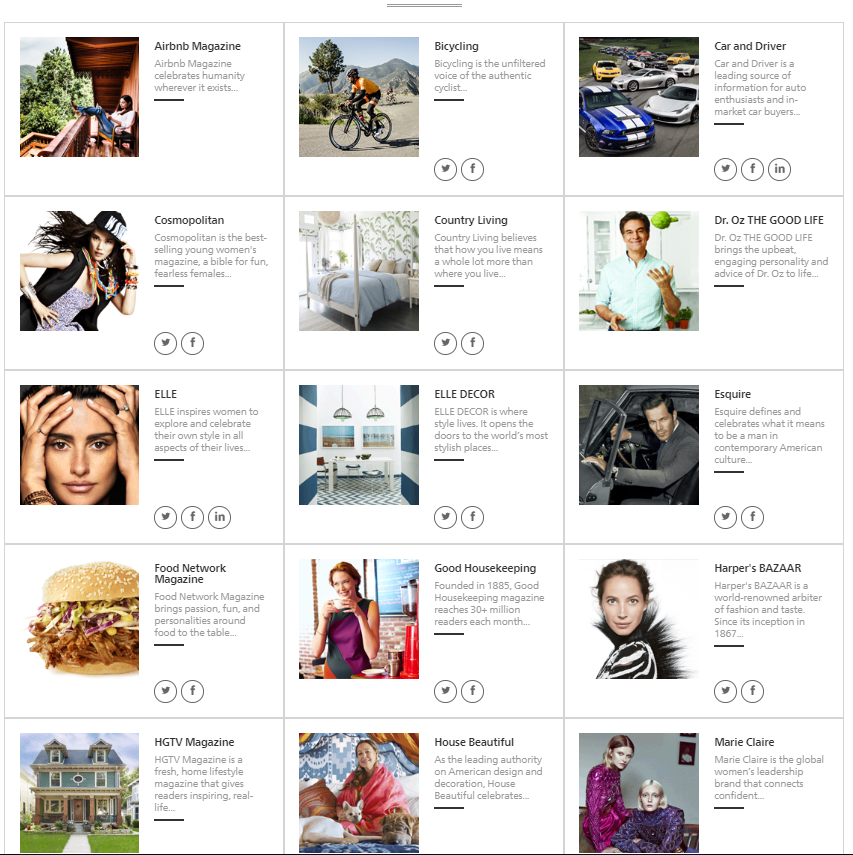
Hearst - "Trusted for decades. Loved by Millions", distributes 'positive' forms of entertainment magazines. 
'Positive Magazine' reinforcement personally isn't as popular as it should be in today's society, which is why i have chosen a travel/fashion magazine - to reinforce positive body image and create an atmosphere of body positivity (something this society is lacking). 
Hearst carry many fashion based magazines along with them majorly being represented for and by women. What Hearst i believe are lacking in is the positive side to men's fashion, society is now opening up to more availability for women within sizes and clothing, weight in general, however what i believe is that there is no representatives for men who aren't the stereotypical 'body type', along with women. 

Monday, July 1, 2019

BAUER AUDIENCE MAGAZINE RESEARCH


Bauer has 49 brands of magazine that they distribute through their company. 49 of which, are mostly aimed at a higher-aged target audience - with the majority of their genre-d magazines are fishing and vehicles. When using their "Audience Finder" and specifying for 18-25yrs, only 6 magazines come up. There aren't any magazines suitably distributed from Bauer for 16-18yrs. Their personal target audience claims to be from 18-75yrs of age, however there are only a handful of magazines that even they specify would attract a younger, more fun audience. Bauer's "Millennials" page explains their improvements into attracting the younger generations, saying their "Millennials Chapter is our first major audience led study...using both qualitative and quantitaive research, we have...findings that both unite and differentiate one of our strongest audiences, digitally native 19-34 year olds". However, this suggests Bauer's exclusive 16+ target audiences is only reached online, and although that correlates into today's society with readers being extremely more digitally involved, it strikes out the target market for printed magazines, where teens and younger generations can access paper forms of entertainment.


Monday, June 24, 2019

The 'Entertainment' Genre

Entertainment Magazines

Sub Genres:


    • Hobbies and Leisure
    • Sports
    • Fashion and Beauty
    • Food and drink
    • Celebrity
    • Art
    • Educational
    • Film and Cinema
    • Home Entertainment
    • Music
    • Tv Guides
    • Computing


    Age Groups -
    • 16-18
    Gaming, Music, Sports, Fashion and Beauty, Celebrity, Technology.
    • 18-21
    Film and cinema, Sports, Fashion and Beauty, Celebrity, Music, Technology
    • 21-25
    Technology,Home Entertainment, Hobbies and Leisure, Food and drink, Sport, Celebrity, Educational.

    My Preferences:
    • Music
    • Fashion and Beauty
    • Hobbies and Leisure


    Monday, February 25, 2019

    BBC Radio 1 Breakfast Show History

    The Radio 1 Breakfast Show

    Currently -
    This radio show lasts 3 1/2 hours (210 mins), starting at 6:30am till 10am every Monday to Thursday. 
    It is hosted by the of recent Greg James, when he started on 20th August 2018 till present. 
    The show is produced by Chris Sawyer and Will Foster at Studio 82A, Broadcasting House, London. 
    Greg James is the newest presenter for the BBC Radio 1 Breakfast Show, being the 16th radio host. 

    Previously -
    The first presenter for the show was Tony Blackburn, speaking the very first words on the show in 1973 and lasted up to nearly 6 years. Many more DJ's have since presented the Breakfast Show, a famous one being Chris Moyles, having his The Chris Moyles Show for over 8 years making him the longest-serving Radio 1 Breakfast Show presenter. 
    There has now been 16 presenters for the show, starting at:
    NoPresenterFromToDuration
    1Tony Blackburn30 September 19671 June 19735 years, 244 days
    2Noel Edmonds4 June 197328 April 19784 years, 328 days
    3Dave Lee Travis2 May 19782 January 19812 years, 245 days
    4Mike Read5 January 198111 April 19865 years, 96 days
    5Mike Smith5 May 198617 May 19882 years, 12 days
    6Simon Mayo23 May 19883 September 19935 years, 103 days
    7Mark Goodier6 September 199324 December 1993109 days
    8Steve Wright10 January 199421 April 19951 year, 101 days
    9Chris Evans24 April 199517 January 19971 year, 268 days
    10Mark and Lard17 February 199710 October 1997235 days
    11Kevin Greeningand Zoe Ball13 October 199725 September 1998347 days
    12Zoe Ball28 September 199810 March 20001 year, 164 days
    13Sara Cox3 April 200019 December 20033 years, 260 days
    14Chris Moyles5 January 200414 September 20128 years, 253 days
    15Nick Grimshaw24 September 20129 August 20185 years, 319 days
    16Greg James20 August 2018present188 days
    From the Wikipedia page ^^ supllied by the BBC Genome Project.

    The show used to run 6 days a week until Feb 1968, when it turned to 5 days a week until June 2018, when the Friday show was dropped and put into their weekend schedule, the Weekend Breakfast. 

    Wednesday, December 12, 2018

    Christmas Studio Photo-shoot Images

    Best:
    I chose this particular mid-shot as one of my best photos for a number of reasons. This photograph would work extremely well as a front cover image due to there being plenty of room at the top of the image for a magazine masthead, and with plenty of angles produced from the female models arm for cover lines and banner headline. Also, the use of the scarf offers a good, blank canvas for other information i want to produce for my front cover.
    A weakness however of this image is the focus, i would have preferred to have the focus on both the models faces but here it is only centered on the the female's face.
    For the briefing, i think this photo fits rather nicely, with the costume and setting fitting in with the winter scheme, i.e the hats and scarfs, and the blurred bauble background. Moreover, the TA for this picture would definitely 16-18 demographic as the models are that similar age so the readers can not only enjoy but relate to the image.
    "Meets the brief well. A fun, life-filled image for winter for your teen TA. Fabulous shot." ~ Soldisee


                                                                                   Best:
    Furthermore, i chose this as my other best image as it creates a sense of reality, and the models expression is a genuine one. It was hard at first to entertain the model, but when i finally got a genuine laugh it bumped up the quality of the photo's, as fake laughter is very obvious when compared to natural expressions. The robin on the shoulder further adds to the fun of the shoot, with it having a Christmas theme, the more fun expressed within the picture i believe the better the image will be. Also, the costume with the woolly hat and scarf were good accessories to add to the picture, conveying the coziness of winter. However, the grey hat and jumper does clash slightly with the backdrop, and so that aspect of the costume i would have most likely altered.

    Friday, November 9, 2018

    Shelter Charity

    Shelter Charity Website

    The charity 'Shelter' help millions of people every year struggling with bad housing or homelessness through there advice, support and legal services, with their aim being to make sure one day no one will have to turn to them for help through campaigning. This campaign offers many ways of help including face-to-face service, a national helpline (0808 800 4444), online advice and legal support. Shelter give people a voice, with hit either being carrying out research, calling on the government to tackle the consequences of the housing crisis or working with the press to ensure that the voices of those effected are heard.  
    Mission Statement: 'Shelter exists to defend the right to a safe home'

    The Layout
    This charity website's layout is very clear and open, with them using white as there background colour to make the page much easier to understand for people who want to donate, learn about this charity or receive help. This literal 'white space' helps separate the design elements conveyed on this page (i.e. the contrasting logo of "Shelter" and the big campaign image) and creates visual groupings within the features. Again, their secondary colour is red, with this alert, bold colour striking against the white background to emphasize the important information - for example, the charity itself "Shelter" or the people they help, like the participants in this charity event wearing bright red tops. However, the charity use the colour turquoise to make the donation side of the website extremely prominent as the overall aim of the charity is to get as man people as they can to donate.
    Alongside this goal, they have then used an image to enhance the motive of this charity (creating a safe place for the homeless) and create a positive atmosphere for the website. The image itself contains two fund-raisers smiling at each other as they show off their achievements on the back of their t-shirts - this happy, positive facial expression represents the cheerful, delighted attitude this charity has towards people raising money and consequently helping the homeless. Rather than using a reluctant, sad picture as the first eye opening image the visitors see and portray gloomy connotations to the website, the charity resemble the happiness the people in need feel after being saved by charitable volunteers.  

    Navigation Bar
    Across the top of the web page is where the navigation bar is located. This campaign ensure to include all topical features that would benefit the visitors, such as 'Housing advice', 'Get help', 'Support us' and 'What we do'. The bar itself is very simple and plain, with no bold colour t make it stand out - however this is not ineffective as people who visit this page do not need these headings to stand out due to the visitors most likely know why they are on this website and so to have them there however not standing out is not a criticism.
    Furthermore, the language used within this whole website is very clear and statistical. To help visitors understand the context more, the charity have included contextual pictures and bold headings, addressing the information they are writing about. Again, the page has used colour to emphasize the heading, with the titles being in the same bright red as the logo, ensuring the visitors understand the importance of the issue Shelter is raising awareness on. 

    Overall, Shelter is a great charity that opens up the eyes of not only the public, but to higher members of society, such as the government, and raises awareness and support to those suffering from homelessness. Their campaigns are endless, from organizing events like sleep walks or donating items to the less fortunate and consequently achieved over £36,928,000 of donations last year. 


    Tuesday, October 2, 2018

    Magazine Textual Analysis


    Magazine Textual Analysis: Miley Cirus Issue of 'Fashion' Magazine.


    The main attraction on the front cover of this magazine is the large, medium-long image of Miley Cirus. The sultry, voyeuristic pose implies the sexual implications of this magazine, and that this “fashion” magazine is specifically targeting female audiences due to the issue having a female model representing women bang in the centre of the cover and so also is representing women’s fashion. Also, by using Miley Cirus as the model of this issue, they make the magazine relatable to young girls as they will recognise the woman on the cover and therefore subconsciously feel more connected to what the magazine is stating.

    Firstly, the bright blue eyes of the model is making eye contact with the reader initially reigning in the admirer, along with the boldness of the eye make-up emphasising the pale blue eyes which in turn matches the mast head of the cover, linking in the model precisely to the issue. Also, the harsh, dark eyebrows and blood red lipstick emphasises the voyeurism of this issue and suggests representations of ‘femme fetale’ which links to the theorist Steve Neale. According to Neale, genre is developed through ‘repetition and difference’. Within the models aesthetic, she is accompanied with red lips, red nails, finger biting, and an extremely scandalous dress including many holes revealing much skin. This creates a convention for sex appeal and confidence which is seen throughout the cover. Not only does the dress imply confidence (and the many holes connotes a ‘web of lies’ through the clothing looking like a spiders web), but the suggestive pose by Miley creates a voluptuous representation of women and that now young girls should look this provocative to be ‘in fashion’ and to fit in with society.

    In addition, a technical code is applied in this issue, with the colour red of Miley’s nails and lipstick connects with the other red features of the magazine that is highlighted in red, implying the other red text is important to the reader of the magazine and the editors want this information to stand out to the reader.

    Moreover, Barthes theory is also applied in this magazine with again the colour red. For the women reading, this colour red could be interpreted in many different ways, with it either meaning confident and sultry, aggressive, or passionate, and so this magazine will therefore be viewed in many different fashions, however it is suggested that the editor of this magazine rather wanted the audience to think of passion and voyeurism due to other connotations made through the image of Miley.

    Furthermore, the contrast of the red, blue and black (all bold colours) against the white background only emphasises the bold statement about women this magazine is creating. This issue of ‘Fashion’ magazine is making a daring implication about women proposing that this image of Miley Cirus is what you fantasise and wish you could look like, and that by reading this issue you can then learn how to draw people (mainly men) in just like this magazine drew you in as a reader. This links to the theory of Stuart Hall. According to Hall, it’s not the denotation that creates meaning, it’s the connotation. This issue is all down to representation, and how today’s society now represents women with these sexual implications, not even implicitly with the provocative medium-long shot but even with denotations such as the text submitted around Miley, such as: “Why you should want sex” or “Shocking is what I’m good at”.

    Thursday, September 27, 2018

    The History of Magaiznes

    The History of Magazines

    See the source image


    Magazines Targeting Women:
    One of the first romance fiction magazine to ever, being published weekly, was Peg's Paper in 1926, that was specifically targeted at a young working-class female readership.
    As you can see from the image on the left, most early magazines targeted at women either refered to homes, housewifery and how to look good or improve your appearance. Periodically, most magazines targeting women came about during the second world war, or pre-war encouraging women to do their best to help their husbands who go to work or to war. Womens duties during that time were to lok after the house and to everything in their power to help their men, in a sexist society their roles were maily house labour such as sewing, refereing to the "clever needlework inside" on this magazine cover, and so magazines for women focused on what society told them to focus on, following societal norms. The use of bright colours on a plain backdrop was popular in this time as well to appeal to the target audience with fashion and make up being a huge pleasure and form of entertainment for women. Cooking was also targeted at women so by using sweet foods on the front covers of magazines would again appeal to women as then it would be percieved as they would be able to to have fun cooking for their husbands and family when it fact this was a labour and duty of women that wasn't all that entertaining - along with cleaning the house.


    Magazines Targeting Men:

    The first ever British magazine targeted at men was published in 1731, being the Gentleman's Magazine and lasted for over 200 years, outrunning the first ever women's magazine. The name "magazine" was used for the first time ever by editor Edward Cave which meant "storehouse". It's original content was provided by regular controbutors and even enveloped books quotes. This differs massively to the womens magazines as historically, men's magazines encouraged them to go to Universitry to become highly educated for good employment and eventually be strong providers for their family. However, unlike womens magazines they included much more excited topics making them more of a pleasure to read and less of a guide and chore.

    Tuesday, September 4, 2018

    Media Forms

    What Exactly Are Media Forms?...

    Over the many centuries, different types of media have spawned all over the world ranging from written formats such as books to varieties of broadcasting like television or movies. 

    Printing

    One of the earliest forms of media came across during the 15th century, which was printing. Before printing was invented in 1440 by the Printing Press, the only form of media was books which were quite rare due to them only being hand written. As the Church had all control at this point in time, the majority of the books were written by monks themselves and so only contained religious studies and beliefs, therefore making it difficult to spread any new ideas and developments other than that of the Church.
    However, after the Renaissance, media was now successfully spreading with different peoples opinions now getting across and developing all over the world.
    The print media includes texts such as newspapers, journals and newsletters which still have big influence and significance in today's society despite the fact that print media has declined over the last few decades.

     
    mentalhelp.net: Types of Media


    Broadcasting

    The newer most upcoming and well known type of media form is "broadcasting". This includes television news, radio news and even to some extent movies and video games. One of the most popular forms of broadcasting media would have to be television news, with many people sticking on the news in the morning whilst getting ready for work, or either switching on in the evening after dinner. However, due to more honesty and truth slowly coming out, many people have chosen not to believe such news broadcast-ed over the television due to the governments selective media that gets show cased over many different television channels. Another form on the other hand is radio broadcasting, which is mainly used when driving as many people prefer visuals however in the car its useful to listen out for traffic news in case of blockages in your route. Obviously, radio was extremely popular before television was invented as its really the second form of media created aside from books and newspapers (printed form) and so still lives on today as a majority, especially with the older generation.
    mediaknowall.com: Media Forms

    Internet

    Without a doubt over the past decade the internet has risen above and beyond and has now become the most popular platform in media history. "The web ... allows for a more interactive approach by allowing people to personally tailor the news they receive via personalized web portals, newsgroups, podcasts, and RSS feeds." - therefore more and more people are steering towards the new, easier way to accommodate new information. Just like this blog i'm currently writing, many people have turned to web blogs to express different types of news feed and by doing so make it more efficient for people to find personal accounts and opinions on certain parts of news or lifestyles, many different opinions can be heard through the use of blogging and more currently a variety of "youtubers" are turning to vlogging, which is a visual account of these blogs.   
    sparknotes.com: Types of Media


    Ke Apo Website

    https://m3gmacmillan.wixsite.com/keapo