Saturday, July 27, 2019

Website Overview

WEBSITE

Suitcase is a travel magazine i take huge inspiration from, and has the relaxed, simplistic theme i wanted for Ke Apo. The sliders seen in the centre of the website is a layout i would want, with slides of landscape photography. The select bar at the top is minimal yet covers everything needed from the readers. One part of this website snapshot that i would not include is the shop aspect, its on the main hot bar and on the left side of the frame there's a cart.
Although this is not related to my genre of magazine, this is just another example of a website layout for a big company's magazine. Q uses their logo in the top right against a black back drop making the name stand out. It also has a drop bar which is a convention across many magazines websites. They further have links to their social media and within the drop box they have subscriptions to their magazines. These are features i'm going to be using for my website as social media is a great marketing technique, especially as printed magazine are becoming out-dated.

Thursday, July 25, 2019

Travel, Fashion & Entertainment Front Covers

Fashion 

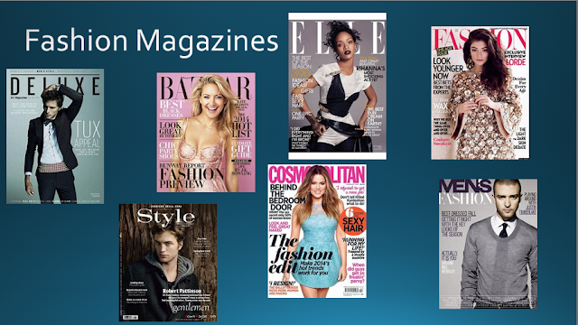
Many fashion genres of magazine's use simplicity to their advantage (for example Vogue, Bazaar, , with the centre medium close up of the model taking focus of the issue. The majority rather than using more photo's spread around the page to highlight offleads, editors use larger fonts and play around with text to enhance the words that they want the audience to pick up when first looking at the issue. For instance, this ELLE cover points out the key words "Margot Robbie, Sex, Skin Nails Hair, 608" - all these words are in old or larger fonts to create connotations of female sex appeal, beauty and are highlighting the huge amount of fashion tips they include in their magazine. This is all to appeal to their target audience, carefully selecting topics that catch the eye of their readers. Many fashion issues also incorporate the model into the masthead, either the mast head sitting behind the model or the model being placed so it covers particular letters - this is done usually in later issue's as readers already know the brand of the magazine. 

Travel

Travel magazines usually use landscapes as their front covers, like Coast, Travel, Traveller, Voyager - and depending on the issue they will relate to the season, such as landscapes of beaches and holiday villas, or mountains and snowy desolate areas. For this issue of Travel, simplicity is also used with the breathtaking view catching the eye of readers. The front is quite basic and so the editor has chosen to use shades of blue to make certain words stand out (for instance "Greek Islands, 50 destination, Two-in-one Thailand) to match the theme of the landscape. Alliteration is used on the front cover to further grab the attention of readers, with the "two-in-one Thailand" highlighting bargains included within the issue. The issue focuses on the appealing offleads within the magazine - such as "summer city escapes" and "great dives" - so rather than stating more information about these escapes available, the magazine just states the places that could apply to these "great dives", creating a more informative magazine for readers.

Entertainment

Entertainment Weekly is just one example of entertainment magazine, however covers much of the 'repetition' seen over many other covers of entertainment genre magazines. Entertainment magazines usually have a lot going on in the front cover, including bright bold colours (much like the primary colours based within this issue's front cover - the yellow in the mast head, along with the blues and red also used throughout the cover). The covers are usually 'loud' - with a lot going on the front cover, unlike Vogue and ELLE, where simplicity is the key element of fashion magazines. The editor used bold fonts as this issue is an iconic one in the film industry, and reflects the insane movie that is being promoted in the issue. 


Contents Overview

Contents

The contents preferred for Ke Apo would be include a understated theme to flow with the relaxed theme of the travel + fashion genre. Monochrome would be a good base for the contents page, with the colour themes of the front cover mixed in with either the photos or some headline's font. The layout of this contents below is appealing due to the collage of pictures at the top of the page. However, landscapes could also be used as a background for the contents, underlying the travel genre of the magazine. The contents below sections the different features within the magazine, which i prefer over just going down in numbers. Photo's that don't make it onto the contents can alternatively go onto the website, therefore the contents won't get cluttered. 


 This contents is in the issue of Hello Fashion Magazine - the July/August Edition, covering the issue with summer vibes. I love the layout of this double-spread contents, with the collumns getting seperated by the thin black lines, and still yet looking uniform and structured eben though they are dotted around images. The imges are spectacular themselves, but another aspect of this contents i like is the way they get rid of the background of images to overlap some, highlighting the specific object whilst also connecting the multiple together. To adapt this i would maybe collage a few more images, as the final collumn has no relevance to the magazine i''m creating.

This other double-spread contents page is from the Cosmopolitan Magazine, and what i love about this contents is the bold, puff'd page numbers surround each image. I think this idea is great for readers, as they have a visual image as to what the article involves within the magazine, and this also helps the reader to locate the many articles within this isue. What i don't love however is how basic the layout is on this double spread, with the mages boringly falling under one another, along with the huge 'Contents' at the top of the page getting cut off - even though that was intentional, i personally thinks it looks like it just didn't fit on the page.

Friday, July 19, 2019

Hearst Research


Hearst - "Trusted for decades. Loved by Millions", distributes 'positive' forms of entertainment magazines. 
'Positive Magazine' reinforcement personally isn't as popular as it should be in today's society, which is why i have chosen a travel/fashion magazine - to reinforce positive body image and create an atmosphere of body positivity (something this society is lacking). 
Hearst carry many fashion based magazines along with them majorly being represented for and by women. What Hearst i believe are lacking in is the positive side to men's fashion, society is now opening up to more availability for women within sizes and clothing, weight in general, however what i believe is that there is no representatives for men who aren't the stereotypical 'body type', along with women. 

Monday, July 1, 2019

BAUER AUDIENCE MAGAZINE RESEARCH


Bauer has 49 brands of magazine that they distribute through their company. 49 of which, are mostly aimed at a higher-aged target audience - with the majority of their genre-d magazines are fishing and vehicles. When using their "Audience Finder" and specifying for 18-25yrs, only 6 magazines come up. There aren't any magazines suitably distributed from Bauer for 16-18yrs. Their personal target audience claims to be from 18-75yrs of age, however there are only a handful of magazines that even they specify would attract a younger, more fun audience. Bauer's "Millennials" page explains their improvements into attracting the younger generations, saying their "Millennials Chapter is our first major audience led study...using both qualitative and quantitaive research, we have...findings that both unite and differentiate one of our strongest audiences, digitally native 19-34 year olds". However, this suggests Bauer's exclusive 16+ target audiences is only reached online, and although that correlates into today's society with readers being extremely more digitally involved, it strikes out the target market for printed magazines, where teens and younger generations can access paper forms of entertainment.


Ke Apo Website

https://m3gmacmillan.wixsite.com/keapo