
Monday, March 16, 2020

Monday, February 24, 2020
Final 2nd issue September - Front Cover and Contents
Front Cover: September 2019 2nd Issue

Contents: September 2019 2nd Issue

Final 1st Issue August - Front Cover and Contents.
Front Cover: August 2019 1st Issue

Contents: August 2019 1st Issue

Monday, February 3, 2020
Script to my audio/visual.
Script
Interview 1 -
Interviewer: Please could you say your name and which expedition you went on?Student: Hello, my name is .... and i went on the American expedition - touring the states.
Interviewer: How would you describe your adventure in three words?
Student: Challenging, dramatic, and wild.
Interviewer: How long was your round trip? Was it exhausting?
Student: The trip lasted over a month, with travelling to a new state every other couple of days, and all together we traveled to five states over that month. It was invigorating and new, but the travelling aspect was for sure a journey, with everyone accepting each other pace.
Interviewer: Was the experience life changing? Would you recommend this experience to other individuals?
Student: The adventure was extraordinary, and definitely a once in a life time opportunity. I would highly recommend this experience to anyone who is offered the chance. Grasp it and just enjoy the ride, although it can be hard and tiring, the memories you make and the adventures you follow will stay with your forever.
Interviewer: Thank you for your time, please just state a motivational phrase to the audience.
Student: Just take the leap.
Interview 2 -
Interviewer: Please could you say your name and which expedition you went on?
Student: Hello, my name is .... and i went on the Spanish expedition - exploring the homes and raising money for charities in need.
Interviewer: How would you describe your adventure in three words?
Student: Emotional, vulnerable and healing .
Interviewer: How long was your round trip? Was it exhausting?
Student: The trip lasted over several weeks, camping in youth hostels and around the coasts, helping charities with saving the planet and exploring the underwater world.
Interviewer: Was the experience life changing? Would you recommend this experience to other individuals?
Student: This trip teaches a lot of life lessons, things you wouldn't think of and you just kinda expect the trip to be like a fun holiday. It can seem like that at times, with everyone involved being extremely friendly, but when you are hard at work, either fund raising or being taught the reality of the damage of the oceans, you become quite emotional and find the experience motivational. I would definitely recommend this to anyone.
Interviewer: Thank you for your time, please just state a motivational phrase to the audience.
Student: Trust your team and yourself.
Tuesday, November 12, 2019
Audio/Visual Planning
Part Of My Expedition Section:
- An interview - set up an interview style video outside, somewhere on location fitting with the travel theme. Students will talk about key moments and how this travelling has reflected their perspectives - if i did? Seek inspiration in younger individuals, relate with experiences and encourage travel.
- Clips from previous travels/future travels fitting context of interview. These clips will follow along with what is said in the interview and create a visual for readers of the magazine.
: together overlap both, montage of clips over interview voice, exampling the blogs within the 'Travel' - sub-categorized expedition section.
Friday, September 13, 2019
KE APO Contents 1st and 2nd issue

ISSUE 1
This is my contents plan for my first issue of KE APO - taking inspiration from contents pages such as Cosmopolitan and Hello Fashion magazines. I decided to do a double spread for the first issue as this is the first magazine that readers will be viewing therefore I would prefer more visuals and content for the very opening issue. I carried on the theme of coral within the accents of the page (i.e. the page numbers and text box borders).
This is my contents plan for my first issue of KE APO - taking inspiration from contents pages such as Cosmopolitan and Hello Fashion magazines. I decided to do a double spread for the first issue as this is the first magazine that readers will be viewing therefore I would prefer more visuals and content for the very opening issue. I carried on the theme of coral within the accents of the page (i.e. the page numbers and text box borders).

ISSUE 2
This is the second issue's contents page, re-sizing to a single page spread. This i because there will not be as much content for the later issues and the issue doesn't have to be to extravagant as it is not the opening one. The accents again follow the colour theme seen on the front page - a dark blue - as demonstrated within the page numbers and again the ext boxes. K.A Contents is one of the features that creatures brand identity, along with having the same/similar heading for each column.

KE APO Front Cover 1st & 2nd Issue

ISSUE 1
The 1st issue of KE APO will feature a first edition banner just under the mast head, highlighting to the audience that this is a new, upcoming travel magazine. I've used a coral coloured puff to enhance the cheap price of the magazine as it is a new magazine, catching the audience's eye but also fitting the summer theme with the colour coral. The date is placed just above the price, letting the readers know which montly issue this is - which will be August as this magazine will be released mid-summer. The grey background signifies an image that i will use for the front cover. The box down in the bottom right corner will be where the barcode sits, and the box above that carrying down the left border of the page will be places that are mentioned within this months issue. There will be no other images located on the front cover of the magazine, as i want a minimalist and simple front cover with it's main focus being the one main feature image filling the page. Therefore, the of-leds surrounding the image will only be text - where some will be coloured with the colour coral to match the issue's colour theme.

ISSUE 2
The second issue of KE APO will have the same features as the first to keep up the brand identity - as that is one of the ost important features when releasing a new magazine. The colour theme however will change to dark blue to fit with the september theme, going into colde months. Again there will only be one main feature image filling the page, and therefore only text surrounding it. The layout will be slightly altered as with every diferent issue, but the date and price will be in the same layout (minus the price puff) and the barcode will be in the same bottom right corner.
Thursday, September 12, 2019
Research shapes and text boxes
Feeling unsure about which text boxes to use specifically for price but also for other pieces of text on my front cover, I researched into different travel magazines and which shapes they used to show the price or just highlighted new in general.


Sticking with Neale's theory of repetition and difference, there seems to be many puff's which are circular or rectangular, especially for price or the 'top' however many things inside the magazine - therefore i have chosen to use a circular puff for my price, using an exotic blue to fit the theme and genre of a travel magazine.
Tuesday, September 10, 2019
Gender Representations
MEN VS. WOMEN VS. OTHER
Gender is a social construction, it is taught to us by external influences and it's ingrained at such a young age that we often mistake is as 'nature' rather than 'nurture' - Butler
According to Gauntlett "performance of gender is foregrounded" - suggesting society dominates our gender due to societal normality. Gauntlett explores the role in digital media in self-identity and self-expression, fighting the stereotypes surrounded by gender. This theory is becoming more and more relevant in modern society and so bringing this theory into my magazine may feel comforting and empowering to readers who don't fit in to gender's stereotypes.
To establish this revolution in gender performance, I have planned and set out photo-shoots to contrast to the classic aesthetics of men - i.e masculine bodies, not wearing feminine colours such as pink, men aren't allowed to cry. This shoot will still appeal to travelling, enthusiastic young individuals, however will be inclusive to those who feel isolated within society without a mocking tone. For example, i planned a natural photo-shoot including male figures dressing femininely to break the stereotypical masculine shoots that cover classic magazine front covers such as Men's Health Magazine.
Along with this theory, another theorist Judith Butler argues "that gender is a social construct" meaning people's sex shouldn't affect anyone's gender or ability to interchange different genders. Butler wrote a book called Gender Trouble which was written as a criticism of the current wave of feminism which saw men as women's oppressive enemy. Butler believed that this perspective makes male and female genders poplar opposites, which only reinforces the idea of patriarchal control between the two genders. This domination in gender is slowly changing, with feminism rising and the equality between the two genders are slowly becoming balanced (within some countries) therefore i want to try and portray this within my photo shoots, as mentioned in the paragraph above. These theorists really link to today's modern society which is why i feel influenced by the two theory's.
Wednesday, September 4, 2019
Photo shoot Planning for Plymouth + Falmouth
Plymouth:
- Surfing - front cover edition 1 - front facing male model, stood holding board on beach. Sandy, wet hair, wet-suit (maybe action shot?)
- beer/form of alcohol (alcopops/lager) drunk in front of scenic view
- More landscape shots of beach, sunset
- Female surfers - ask surfers on beach - same shot as male just woman - confident shots - female health and body confidence - empowered connotations - intense gaze/ cheeky smirk.
- beer on the beach/ beer on surf board
Falmouth:
- Uni shots - open day, link to target audience with the majority still being in education
- More landscape shots
- Cocktails on the beach
- Dog beach shots - link to travel aspect and show case good dog friendly beaches
Sunday, September 1, 2019


Thursday, August 29, 2019
Ké Apo
Photo's to consider... Front Cover

This unbalanced, angled shot was a trick to the eye - with the horizon off balance with the rock in which i took the photo off. The beach background and surfer aesthetic fits with the travel and fashion theme, with surfing being a great contending holiday. However, the tilt does not fit the criteria for a front cover image, and personally i feel the medium-long shot of the model is too far away for a front cover, especially a first edition.

This is a closer up, medium close shot of the model, a better contender for a front cover image with the facial features being more identifiable when up-close. The slight smile in the model's face makes for a natural image, along with the wet hair ad surf board making up the components of a relaxed, beach photo. This photo on the other hand doesn't convey any of the criteria's i would want on a front cover of Ké Apo, as the magazine is focusing on body positivity and the natural, realistic image of models. Although this model does look extremely natural, with no costume except the wet suit, it doesn't express any powerful connotations that i feel a first edition would need.
Sunday, August 11, 2019
Ké Apo
Photo's to consider... Contents + Website


This side shot, right center-frame photo of Yellowbelly Pizza ties with the travel/tourism genre of my magazine, with recommendations for food and drink being one of my tasks when getting shots. This is in my local town, however it's aesthetic rather looks more foreign than local - maybe in the streets of Italy. Other shot's that i shall be getting in the future is maybe ice cream shots at the local ice cream parlor, or cocktails from the local pub, taken in the beer garden on a bright (holiday esc. weather) day.


These are great travel shots i got when in Bavaria, Skiing. I love the mountain range in the background - this ties in wonderfully with my travel magazine, this could be used for my contents either as a background or collaged together with other mountain-range shots i got up at the resort. These and other landscape shots could further be used for my website, again either collaged or used on a sliding frame at the top of the website, rotating through different landscape shots.
Both the shots would fit nicely with either edition, August or September, as they can be used as winter get-away shots, or just alternative holidays than one's most popular on the beach. Shots i missed out on however when there were action shots of people skiing and snowboarding - however my magazine isn't sport-based so it may not have fit the genre.


These are great travel shots i got when in Bavaria, Skiing. I love the mountain range in the background - this ties in wonderfully with my travel magazine, this could be used for my contents either as a background or collaged together with other mountain-range shots i got up at the resort. These and other landscape shots could further be used for my website, again either collaged or used on a sliding frame at the top of the website, rotating through different landscape shots.
Both the shots would fit nicely with either edition, August or September, as they can be used as winter get-away shots, or just alternative holidays than one's most popular on the beach. Shots i missed out on however when there were action shots of people skiing and snowboarding - however my magazine isn't sport-based so it may not have fit the genre.
Saturday, July 27, 2019
Website Overview
WEBSITE

Suitcase is a travel magazine i take huge inspiration from, and has the relaxed, simplistic theme i wanted for Ke Apo. The sliders seen in the centre of the website is a layout i would want, with slides of landscape photography. The select bar at the top is minimal yet covers everything needed from the readers. One part of this website snapshot that i would not include is the shop aspect, its on the main hot bar and on the left side of the frame there's a cart.
 Although this is not related to my genre of magazine, this is just another example of a website layout for a big company's magazine. Q uses their logo in the top right against a black back drop making the name stand out. It also has a drop bar which is a convention across many magazines websites. They further have links to their social media and within the drop box they have subscriptions to their magazines. These are features i'm going to be using for my website as social media is a great marketing technique, especially as printed magazine are becoming out-dated.

Thursday, July 25, 2019
Travel, Fashion & Entertainment Front Covers
Fashion
 Many fashion genres of magazine's use simplicity to their advantage (for example Vogue, Bazaar, , with the centre medium close up of the model taking focus of the issue. The majority rather than using more photo's spread around the page to highlight offleads, editors use larger fonts and play around with text to enhance the words that they want the audience to pick up when first looking at the issue. For instance, this ELLE cover points out the key words "Margot Robbie, Sex, Skin Nails Hair, 608" - all these words are in old or larger fonts to create connotations of female sex appeal, beauty and are highlighting the huge amount of fashion tips they include in their magazine. This is all to appeal to their target audience, carefully selecting topics that catch the eye of their readers. Many fashion issues also incorporate the model into the masthead, either the mast head sitting behind the model or the model being placed so it covers particular letters - this is done usually in later issue's as readers already know the brand of the magazine.
 Travel
 Travel magazines usually use landscapes as their front covers, like Coast, Travel, Traveller, Voyager - and depending on the issue they will relate to the season, such as landscapes of beaches and holiday villas, or mountains and snowy desolate areas. For this issue of Travel, simplicity is also used with the breathtaking view catching the eye of readers. The front is quite basic and so the editor has chosen to use shades of blue to make certain words stand out (for instance "Greek Islands, 50 destination, Two-in-one Thailand) to match the theme of the landscape. Alliteration is used on the front cover to further grab the attention of readers, with the "two-in-one Thailand" highlighting bargains included within the issue. The issue focuses on the appealing offleads within the magazine - such as "summer city escapes" and "great dives" - so rather than stating more information about these escapes available, the magazine just states the places that could apply to these "great dives", creating a more informative magazine for readers.
Entertainment

Entertainment Weekly is just one example of entertainment magazine, however covers much of the 'repetition' seen over many other covers of entertainment genre magazines. Entertainment magazines usually have a lot going on in the front cover, including bright bold colours (much like the primary colours based within this issue's front cover - the yellow in the mast head, along with the blues and red also used throughout the cover). The covers are usually 'loud' - with a lot going on the front cover, unlike Vogue and ELLE, where simplicity is the key element of fashion magazines. The editor used bold fonts as this issue is an iconic one in the film industry, and reflects the insane movie that is being promoted in the issue.
Contents Overview
Contents
The contents preferred for Ke Apo would be include a understated theme to flow with the relaxed theme of the travel + fashion genre. Monochrome would be a good base for the contents page, with the colour themes of the front cover mixed in with either the photos or some headline's font. The layout of this contents below is appealing due to the collage of pictures at the top of the page. However, landscapes could also be used as a background for the contents, underlying the travel genre of the magazine. The contents below sections the different features within the magazine, which i prefer over just going down in numbers. Photo's that don't make it onto the contents can alternatively go onto the website, therefore the contents won't get cluttered.


This other double-spread contents page is from the Cosmopolitan Magazine, and what i love about this contents is the bold, puff'd page numbers surround each image. I think this idea is great for readers, as they have a visual image as to what the article involves within the magazine, and this also helps the reader to locate the many articles within this isue. What i don't love however is how basic the layout is on this double spread, with the mages boringly falling under one another, along with the huge 'Contents' at the top of the page getting cut off - even though that was intentional, i personally thinks it looks like it just didn't fit on the page.

Friday, July 19, 2019
Hearst Research
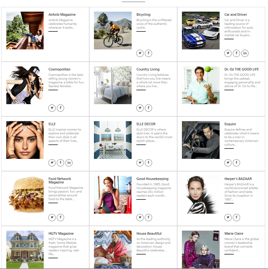
'Positive Magazine' reinforcement personally isn't as popular as it should be in today's society, which is why i have chosen a travel/fashion magazine - to reinforce positive body image and create an atmosphere of body positivity (something this society is lacking).
Hearst carry many fashion based magazines along with them majorly being represented for and by women. What Hearst i believe are lacking in is the positive side to men's fashion, society is now opening up to more availability for women within sizes and clothing, weight in general, however what i believe is that there is no representatives for men who aren't the stereotypical 'body type', along with women.
Monday, July 15, 2019


Monday, July 1, 2019
BAUER AUDIENCE MAGAZINE RESEARCH

Bauer has 49 brands of magazine that they distribute through their company. 49 of which, are mostly aimed at a higher-aged target audience - with the majority of their genre-d magazines are fishing and vehicles. When using their "Audience Finder" and specifying for 18-25yrs, only 6 magazines come up. There aren't any magazines suitably distributed from Bauer for 16-18yrs. Their personal target audience claims to be from 18-75yrs of age, however there are only a handful of magazines that even they specify would attract a younger, more fun audience. Bauer's "Millennials" page explains their improvements into attracting the younger generations, saying their "Millennials Chapter is our first major audience led study...using both qualitative and quantitaive research, we have...findings that both unite and differentiate one of our strongest audiences, digitally native 19-34 year olds". However, this suggests Bauer's exclusive 16+ target audiences is only reached online, and although that correlates into today's society with readers being extremely more digitally involved, it strikes out the target market for printed magazines, where teens and younger generations can access paper forms of entertainment.
Subscribe to:
Posts (Atom)

-
Magazine Textual Analysis: Miley Cirus Issue of 'Fashion' Magazine. The main attraction on the front cover of this magaz...
-
 Photo's to consider... Contents + Website This photo would be considered for contents page or the website, with the Hawaiian shirt ...